Introduction
We have recently started using a segmented button in some of our websites without any consistency in the rules of when to use it or how it differs from the tabs that already exist in Vanilla. This document aims to give some context on when to use a segmented button v. the traditional tabs, and what are the variants of this component.
Considerations
Most design systems only use tabs. This is what is currently available in some of them:
Apple iOS Guidelines
- Tab bar: it’s mainly a navigation bar used at the bottom of the screen on different apps.
- Segmented control: it’s a mutually exclusive button. Works similar to our tabs, although they say they can be used often to switch between views (on maps for example).
Carbon
- Tabs: they only have a tab component which is similar to the one we have on vanilla. They have one variation similar to the tabs on a folder, which they specify is mainly for use in large sections of a page, whereas the normal tab without a container is for smaller contexts on the page, like tabs on a card.
Material Design
- Tabs: in material they have tabs that are modular. With a shadow they are used for navigation, at the header of a page for example. They also have a lighter version without a shadow which is similar to the one in Vanilla. They have an option with icons on the left side of the label or on top.
Variants
Regular
With icon

Without icon

Dense
With icon

Without icon

Usage
There are two main scenarios for using the segmented control:
Secondary tabs: if the page already has a set of primary tabs used as navigation, these can be used as a sub-navigation of those primary tabs. The use of icons or the size of the button depends on a case by case basis. For example on the JAAS dashboard where tabs are used as page navigation, these could be used as sub tabs of that page.
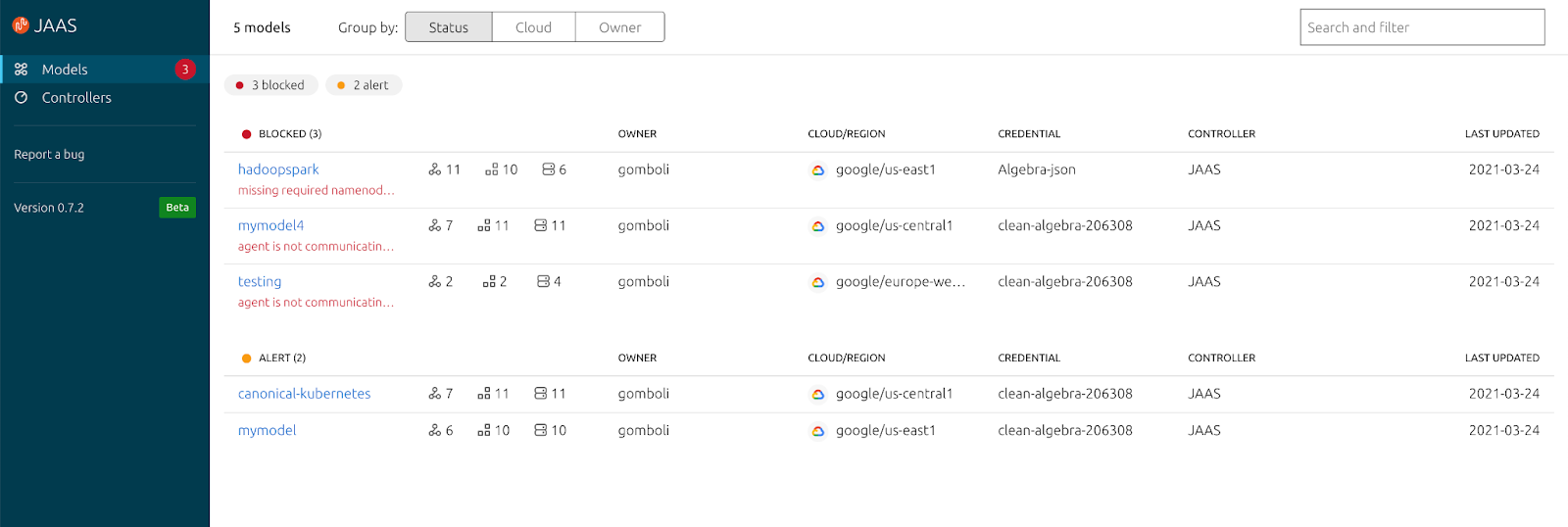
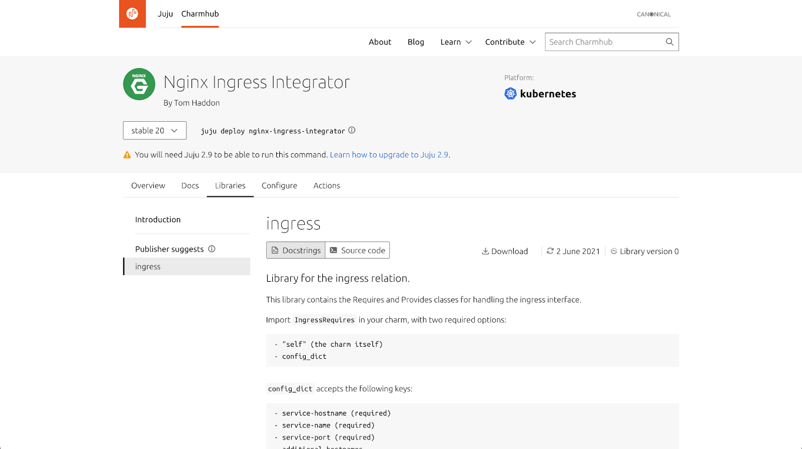
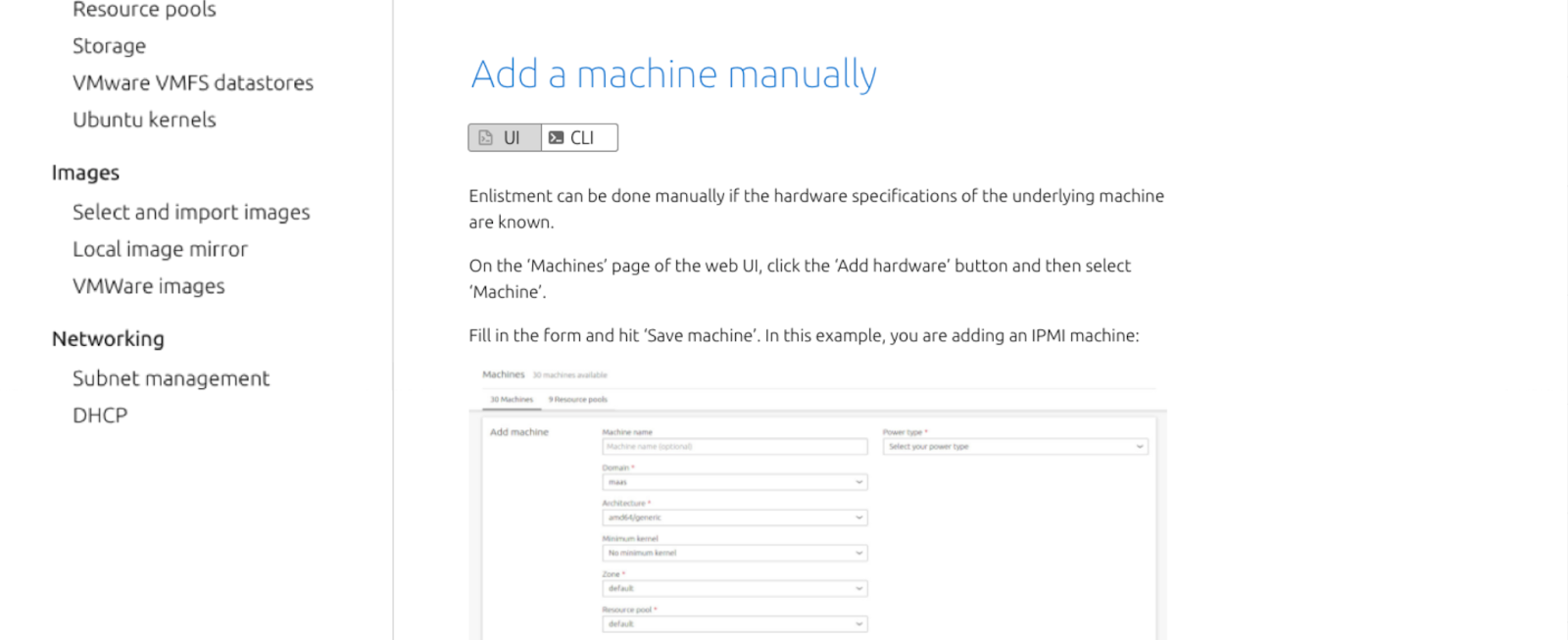
View switcher: in the case of a page in which the same piece of content is shown in more than one format, this component can be used as a switcher between the different views. For example, in docs it can be used to switch between CLI and UI (as in MAAS RAD docs) or to switch between a processed view and its source code (as in the charm libraries).
Other considerations:
- Ideally segmented controls should be kept to the minimum amount possible of sections to improve usability.
- Don’t mix and match icons and no icons so that the interface is not confusing to users.
- Try to size the content on each tab similarly, so that users don’t encounter pages that are significantly different in each section of the controller.
Size and use of icons
By default the regular size should be used, similarly to how we use the button component. If there is already a field or a button horizontally aligned, regular size should be used to match the same height.
If there is a concern for vertical space the dense button can be used.
- The use of icons is to be determined by the UX and visual designers of each project where they are necessary.
Mobile
- It is recommended to keep the number of segments for the button low to avoid the button overflowing on smaller screens and reduce cognitive load.
- In the case the items overflow the viewport, this component can be replaced by a dropdown.
- Avoid using the small size on mobile devices where the target area wouldn’t be accessible.
Behaviour
Inactive state
By default this component will always have one selected item (similar to tabs).

Hover
On hover the background of the button will change to a light gray (current JAAS implementation).

On click
The segment that was previously selected will be unselected and the one clicked will now appear selected. By default this component acts as a mutually exclusive button.

Examples of this component in use
JAAS

In JAAS the segmented button is used as a view switcher that will change the grouping of the models in the dashboard. The content remains the same, only the grouping is affected in this case.
Charmhub

On Charmhub the component has been used as well as a view switcher to change between the source code of the charm libraries, and the rendered docstrings in a processed way. In this case they also act as secondary tabs, since this content is already included within a set of regular tabs.
MAAS

MAAS has included segmented buttons in their new designs for docs. In this case they act as a view switcher between docs for the UI or the CLI.
Questions to ask yourself before using this
- Can I use the tabs instead?
- Do I need a view switcher?
- Do I already have tabs on this page?
- Is there a concern for vertical space?
- If yes, use the smaller sizes
- Can I add an icon to all the segments?
- If not, don’t use any icons.
- Are there too many segments in this button? (try to keep it under 5, optimally 2 or 3)
- Does it fit in the viewport on smaller screens? If not, replace it with a dropdown.
- Is the target area big enough for touch screens? If not, use a larger size button.


