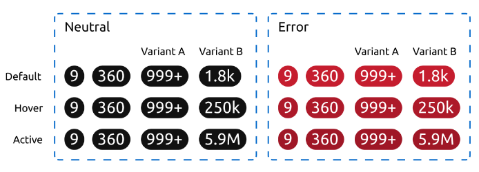
A badge is a visual indicator for, and only for, numeric values.
To remove inconsistencies between various Vanilla components used for similar purposes, we decided to redefine some components:

Variant A: Undefined large number
Variant B: Rounded large number
The Badge is a rectangle with full rounded borders. There will never be more than 4 characters inside it.
There are three statuses:
As we said, this component is not interactive. The hover and active status of this component exist only for situations where the badge is used inside another component. If the parent component has a hover state, the state of the badge will change accordingly.
When a numeric value has to be shown and highlighted, for instance:
Never use this component to highlight any non-numeric value. We will use the Status label for this kind of scenario.
Don’t use this component if any kind of interaction is necessary. Badges are static and not interactive.
Avoid this component if rounded values are not acceptable. In cases where the exact value is necessary even for large numbers, the badge won’t provide enough information. Consider any other acceptable kind of text form.
Since there will never be more than 4 characters in our badge, we need to make a decision on how to show large numbers, i.e. values larger than 999. Depending on the nature of the value, it might be enough to know that there are more than 999 items. In some scenarios, though, a rounded approximation to the real value could be necessary. There are, therefore, two variants of this component:
| Variant | Description |
|---|---|
| Undefined large number | Values over 999 are shown as 999+ |
| Rounded large number | Values over 999 are rounded, e.g. 1.8k, 19k, 5.9M, etc. |
When the amount of items is only relevant for small values, this one is the variant that should be used. When the value grows further than 999, the badge will simply show 999+.

This is the default variant and it should be used in most cases. Relevant large numbers are probably too important to be inside a badge.
When the value of the badge represents a type of information where differences between large amounts of items are relevant, this variant will provide a better experience. It will include a decimal unit prefix and round the value. Since there is a limit of 4 characters, there are two rules regarding the prefix and the decimals:
